
Design for Reach; Rethinking the Mobile Menu
My masters thesis examines
mobile eCommerce navigation, questioning whether the hamburger menu
supports efficient, user-friendly experiences or if better
alternatives exist.
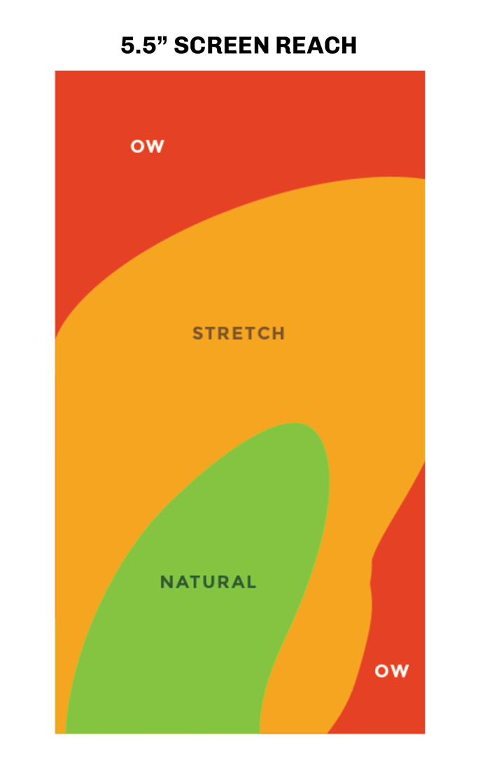
The hamburger menu,
typically placed in the top-left corner, is the dominant
navigation pattern in mobile eCommerce but may not align with
modern mobile ergonomics or user behaviour.
Key Insights from Discovery
-
Industry standard heavily relies on the hamburger menu
-
Poor accessibility for one-handed use (thumb reach limitations)
-
Navigation friction impacts speed, confidence, and overall UX
A research-led UX process
combining analysis, prototyping, and user validation.
Process
-
Conducted a case study of leading eCommerce platforms
-
Applied UX principles and ergonomic considerations
-
Designed two navigation prototypes for comparison
-
Tested through task-based usability studies, questionnaires, and interviews
Developed and evaluated
two navigation systems. One being the traditional hamburger menu
(top-left) and the second being bottom bar navigation
(thumb-accessible, hybrid approach).
Key Outputs
-
Mobile navigation prototypes
-
User testing flows and evaluation framework
-
UX insights grounded in real user interaction
Users consistently preferred
the bottom-aligned navigation, finding it easier to reach, more
efficient to use, and overall more intuitive. The results
demonstrated that widely adopted design patterns are not always
optimal, reinforcing the value of designing around real user
behaviour.
Learnings
-
This project reinforces a research-led UX approach, combining:
-
Analytical case study
-
Human-centred design thinking
-
Real user validation
It highlights the
importance of questioning conventions and designing based on
actual user behaviour, not familiarity.